

Why Delight Matters: The Case for Building Thoughtful & Clever Product Experiences
When it comes to allocating resources, the easiest types of product initiatives to justify and prioritize are those that fulfill the “transactional needs” of a business — a functionality that allows users to do X, or an optimization that makes Y more efficient.
What’s much harder is to figure out what resources (if any) to devote to product initiatives without “meat on the bone.” You know, like things that are just supposed to create a “better user experience.” How are you supposed to quantify the impact of an experience that puts a smile on a user’s face? In an ideal world of prioritizing based on impact vs. effort, it then becomes hard to find room for these “user delight” initiatives on the product roadmap (which means you will never get to them).
But just because it’s hard to measure delight doesn’t mean you should ignore it in your product development roadmap. Here’s what delighting users entails — and why startups should care about it (even at the early stage).
The Tenets of a Delightful Product Experience
Product initiatives that bring users delight can be large or small — if successful, they fulfill the emotional needs of your users. When I think about how to create a positive emotional bond with users through a digital experience, I focus on these few key tenets (with some examples from Blue Apron, where I used to run product):
Thoughtfulness
At Blue Apron, we tried to apply this tenet to our “Meal Rescheduler”. This subtle yet useful feature allows you to reschedule a particular week’s delivery away from the default day of the week. One use case is when a user will be busy for early part of the week, so she’d want to shift the delivery to closer to the weekend.

Meal Rescheduler — launched after clicking “Manage Delivery”
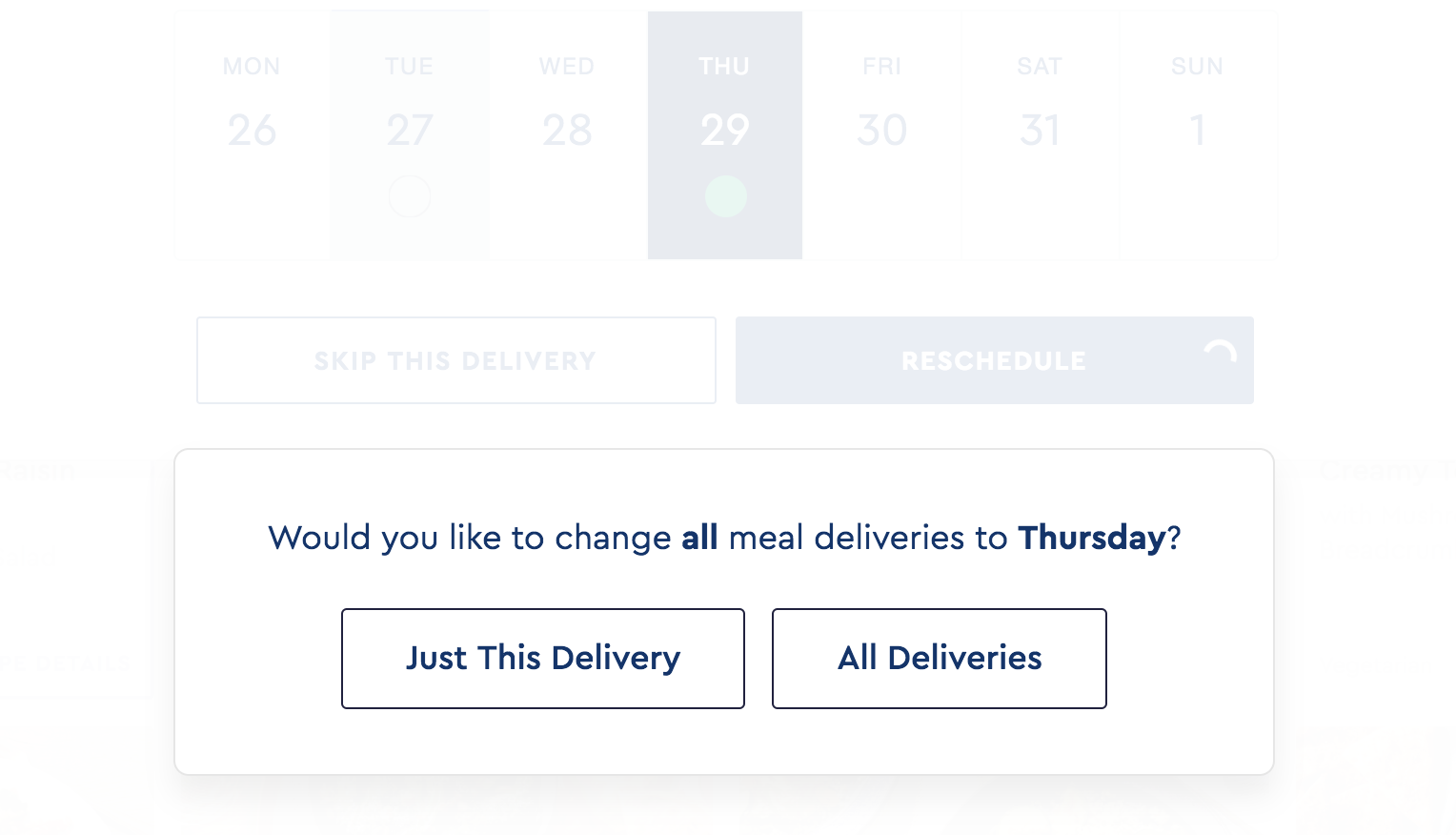
However, some users might not have realized that Blue Apron provides such flexibility around delivery scheduling and might decide that Thursdays are better days for ALL weeks.
The product could just stop at the initial, one-off rescheduling — but it goes one step further to make sure those who would enjoy receiving their deliveries now on Thursdays can do so with one click:

Meal Rescheduler — reschedule one or all deliveries
This might seem trivial, but imagine the otherwise frustrated user: “Oh great I can receive the delivery on Thursday; do I have to go do this ONE BY ONE??” This user experience is much more thoughtful.
High Polish, Low Friction
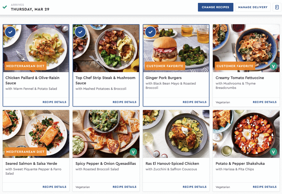
A polished experience with minimal friction shows respect and establishes trust — both of which are foundational building blocks for positive emotions. Below is part of the web app that Blue Apron customers manage their deliveries and recipe preferences. This part of the product is highly transactional for the user, but it also offers a few delightful moments:

The “Change Recipe” experience
From the + icon that “bounces” when you hover over the recipe, to the subtle transition animation of + to ✓ when you select your meal, to recipe details that don’t take you away from the selection experience, to the confirmation message that fades away, the small, polished details matter.
Unexpected Cleverness
People say under promise and over deliver, and there are still tons of opportunities to do so through digital experience. Two of my favorite product areas to do this are empty states and loading screens. Do something to that (otherwise dull) prime real-estate!

Recipes not available yet — why not teach people some knife skills?
On the surface, these types of features sound like “nice-to-haves” until you’ve reached a certain growth stage — but I think more startups should make time for building a delightful user experience. Here’s why.
Why Delighting Users Is Worth Your Time
Think about the last time you experienced minor irritations during your interaction with an app or a website. Maybe the error message just said “something is wrong” without telling you how to fix it, or maybe it took 10 minutes to find out how to filter your search results after you’ve painstakingly scrolled through hundreds of items.
These seem trivial. You probably won’t decide to abandon the product based on one interaction, but you likely left that interaction with some negative sentiment and energy.
The impact of these “minor frictions” on your business will be hard to notice at first. Your KPI dashboard won’t tell you something’s wrong. Your users might not even realize it, but they are gradually associating your brand and product with the dreading experience of going to the DMV. Slowly but surely, your company will experience death by a thousand subpar product experiences.
So why does this matter? Users have high expectations for products these days. Letting your users suffer leaves a void for competitors to come in and crush you with delight and wow.
This is how Sunrise, an ex-NextView portfolio company that was arguably the most beloved calendar app that’s ever existed, came into a crowded market and crushed everyone. As a user, I had such fond emotional ties with Sunrise because its user experience just seemed so thoughtful — it consistently put smiles on my face when managing my calendar would’ve otherwise felt like an annoying chore. Positive emotions and delight translate to brand loyalty and user retention.
Okay, so let’s say that you’re bought in as a company and want to bring delight to your users. If you’re already resource-constrained, how do you actually prioritize building delight into your product roadmap?
How to Squeeze Delight Out of Your Already Full Roadmap
As the old adage of product management goes, the product backlog is never empty. Usually, it’s filled with things that address the transactional needs of the users and the company. Below are some tactics that could help create a product culture that keeps user delight top-of-mind:
Play the Long Game
As a company, think about delivering delightful moments as putting small amounts into your savings account. Savings are not built in one day, nor is brand equity. The savings account you build up will come handy during rainy days — the inevitable ups and downs during a company’s lifecycle (e.g. new competitors, internal misstep, broader market shift).
Establish the Polish Bar
As I mentioned in another post, the importance of establishing where your company sits on the “speed vs. polish” spectrum is usually overlooked as the company grows. Sometimes delighting users comes down to creating a thoughtful, easy experience, which usually just means hitting a high polish bar. If that’s what you want out of your product and engineering teams, you owe the team a clear definition of what “high polish” means and acknowledge the tradeoffs that would come along with clearing that bar.
Consistently Carve Out Resources for Delight
I’ll admit, this is harder to implement in reality than it seems, as the product team is always on the receiving end of the pressure to do more, faster. However, I believe there’s a way to develop the organizational discipline to proactively deliver delight. I suggest setting a specific quota of resource allocation to delight initiatives in advance of roadmap planning meetings — and stay firm to that allocation. For example, you could consistently carve out 5% of the engineering/design bandwidth in a given quarter or dedicate two sprints per year to projects that delight.
Whatever the amount, what’s most important is establishing the consistency (and thus the organizational habit) so you don’t forget about the feelings of your users.
How do you prioritize delight in your product roadmap? I’d love to hear your stories on Twitter.


