

Be Like Water – A Guiding Principle for Consumer Product
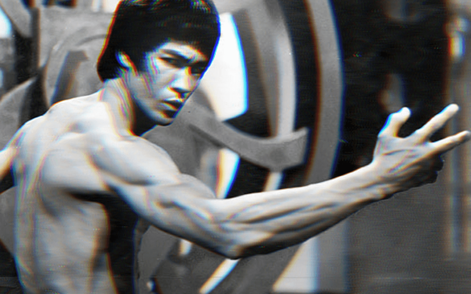
“Be formless, shapeless, like water.” – Bruce Lee
I was on a pitch video call the other day when the founder asked me what the guiding principle for product was at Blue Apron when I was leading the team there, and my response was that consumer product experience should be like water. At a first glance, that could sound pretty counterintuitive – isn’t the point of a product team to purposefully design and build?
In my opinion, the purpose of a software product (and by extension the product management team) is to harness technology to meet user needs and drive business goals. Explicit user needs are the easiest part of this – e.g. users need to be able to check out using PayPal, so lets build PayPal integration into the checkout funnel. Implicit user needs are harder to discern but many are observable via data or user research – e.g. given the high funnel drop-off rate, users might want to see pricing information upfront. However, just by building to fulfill the obvious user needs usually does not create a great product experience that can really move the needle on business outcomes – this is where being like water comes in.
One of the key challenges for product teams is that consumers usually do not think about the product or service being offered as the software itself – for Blue Apron it’s the food, for Uber it’s the car ride, and for Instagram it’s “fun mindless entertainment”. From the user’s point of view, the software experience is just “the app” they use to change their recipe selection or order a ride. To have a shot at influencing behaviors beyond the clear objective they have, the product experience needs to be like water – ever-present in the consumer’s user journey, while nudging towards the desired direction and action in a subtle and non-intrusive way.
Be ever-present like water
“Be like water” is a powerful analogy and goal to keep in mind because it makes you think harder about how to surround your users with the product experience along the user journey, filling out the white space with every tiny drop. This is most easily achievable on the main product canvas, such as your mobile or web app when the user is drawn there for an explicit user need.
The less obvious (and harder) challenge is how to extend your presence beyond the primary product canvas. There are two ways to think about this. One strategy is to hone in on the offline parts of the user journey and figure out if any of those are worth bringing online – can you deliver more value to users by addressing such steps digitally? The other strategy is to look for tools other than your main product canvas that are at your disposal – email, push notification, SMS, browser extension, and even physical canvases that are otherwise non-obvious (think the Amazon branded packing tapes). Every single touchpoint reinforces one another and presents an opportunity to engage and influence.
Be subtle like water
The aggressive, in-your-face design works when you’re sure this is what the user wants to do anyway, and you’re just helping them navigate effectively. To effectively nudge the user into actions and behaviors that were previously not top-of-mind for them, you want to design the digital experience to be subtle. Nudging the user in a gentle way without being disruptive to the primary action that drew them in in the first place. The objective here is to extend the reach of your product canvas – while the user is here for A, can you shape the product experience to guide users towards B or C?
When Instagram first introduced Stories, they placed the story bubbles on top upon first opening the app, but if the user decides to scroll through the Feed (which was the primary intention of most users) the row of bubbles would disappear and only resurface after they had the opportunity to consume the Feed first. This seems like a small design decision, but it strikes the right balance between the business objective (Story consumption) and the user’s desire (Feed consumption).
When you’re building a consumer product, it is easy to get fixated by the existing product canvas you have to work with and get bogged down by details. Thinking about how your product experience can be more like water can help free your mind and open new possibilities.


